Notes On The Edition Process––Tonal Architecture & Screen Separation
The silkscreen editions derived from Erik Brunetti’s ink drawings are often perceived initially as monochromatic works, though their production methodology is considerably more complex than a conventional black-and-white screenprint reproduction.
While the source drawings may initially register visually through restrained tonal palettes, the original works contain extensive internal variation in density, texture, edge definition, atmospheric depth, and accumulated mark-making. These subtleties cannot be translated faithfully through a single black ink pass without collapsing significant portions of the image into flat contrast.
For this reason, the editions are constructed through multiple tonal separations rather than a one-color screenprint process. Each layer carries distinct visual information calibrated to preserve the structural relationships within the drawing — including shifts in warmth and coolness, compression within shadow areas, soft transitional gradations, and the physical accumulation of ink and gesture present in the originals.
The process shares greater affinities with photographic tonal translation and fine art gravure methodology than with commercial monochrome silkscreen production. Rather than functioning as a direct mechanical reproduction, the separations are built interpretively, with each screen calibrated to preserve what may be described as the tonal architecture of the drawing.
This approach allows the editions to retain a sense of atmospheric depth and physical presence that would otherwise be lost through simplified reproduction methods. Areas that appear optically uniform from a distance often contain numerous overlapping tonal events requiring separate exposures, adjusted mesh densities, and carefully controlled ink application in order to maintain fidelity to the original work.
The resulting prints preserve both the material characteristics unique to hand-pulled silkscreen printing and the tonal complexity embedded within the source drawings themselves.
As with traditional atelier printmaking practices, extensive proofing and registration adjustments are undertaken throughout production. Individual layers are refined through successive test pulls to ensure tonal continuity, edge precision, and consistency across the edition. Slight variations inherent to the hand-printing process are considered part of the material character of the work.
All editions are produced using archival materials and individually inspected for registration fidelity, surface consistency, and tonal accuracy prior to release.
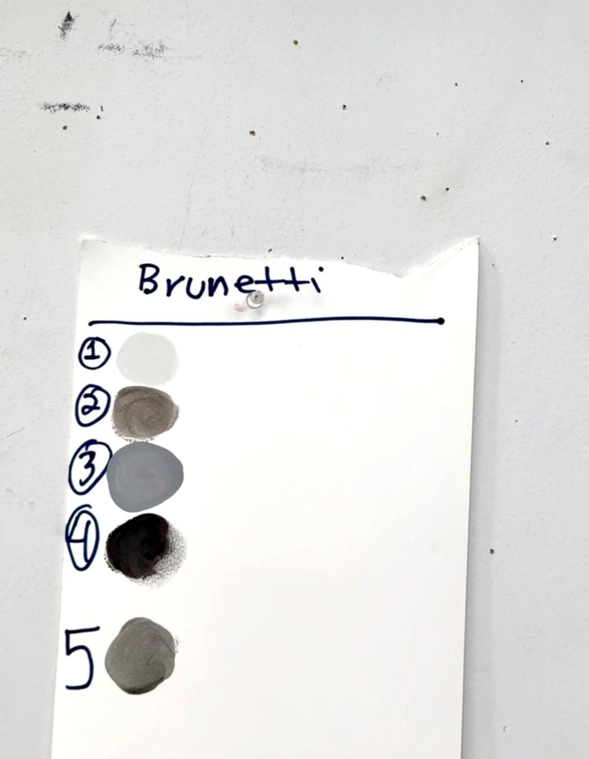
Future archival materials accompanying these editions may include process documentation, tonal separations, proofing stages, registration studies, and production photography in order to further contextualize the translation of the original drawings into silkscreen form.
The complete body of Prints & Editions, including current and archival releases, may be viewed through the Erik Brunetti Studio editions archive at erikbrunetti.com.
Additional material specifications, process notes, and acquisition information accompany each edition where applicable.